CBS design
The purpose of this design guide is to simplify how we create good visual communication and make it clear that CBS is the sender.
We present a tool box with basic elements as well as inspiration and templates for a lot of different purposes. If you have any questions, please send an e-mail to communications@cbs.dk
The DNA of our visual identity
The most important elements of our identity’s DNA is in CBS’ logo:
Blue
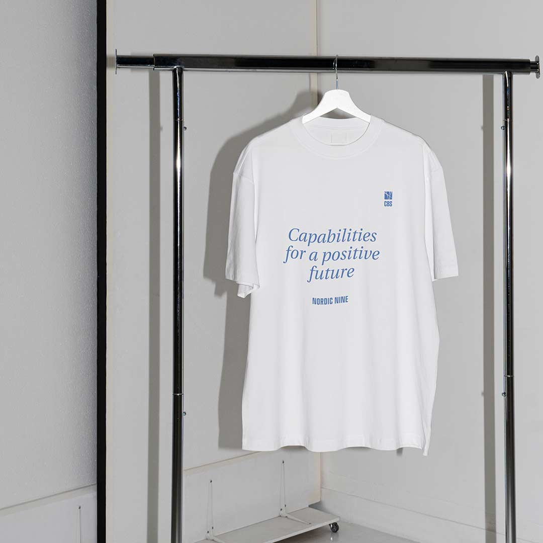
CBS Blue is the primary colour in the colour palette. It is used in the logo and for everything from backgrounds, headings, illustrations merchandise etc.
CBS NEW
CBS NEW is CBS’ own typography which was drawn by the design agency 1508 for CBS in 2012. CBS New is used across media as the most dominating typography.
The square
The quadratic shape forming the emblem of CBS’ logo is repeated in the grid used for making frontpages and posters and cropping photos.
These three elements are the corner stones of our identity.
Logo
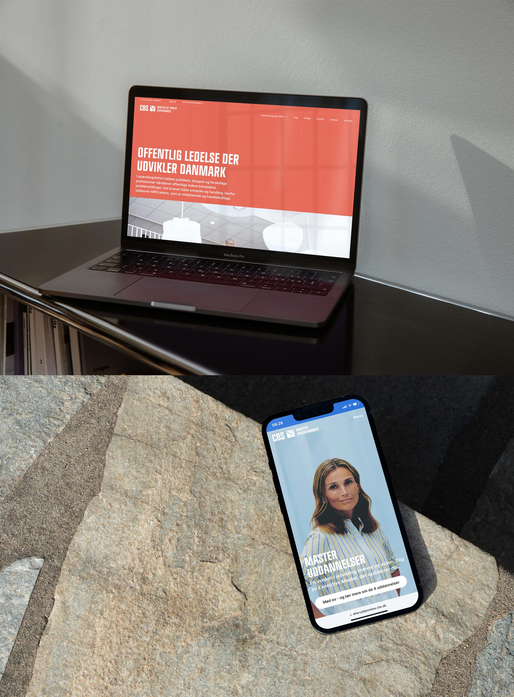
To create a strong CBS brand and recognition across media and platforms, CBS only has one logo, but a flexible logo.
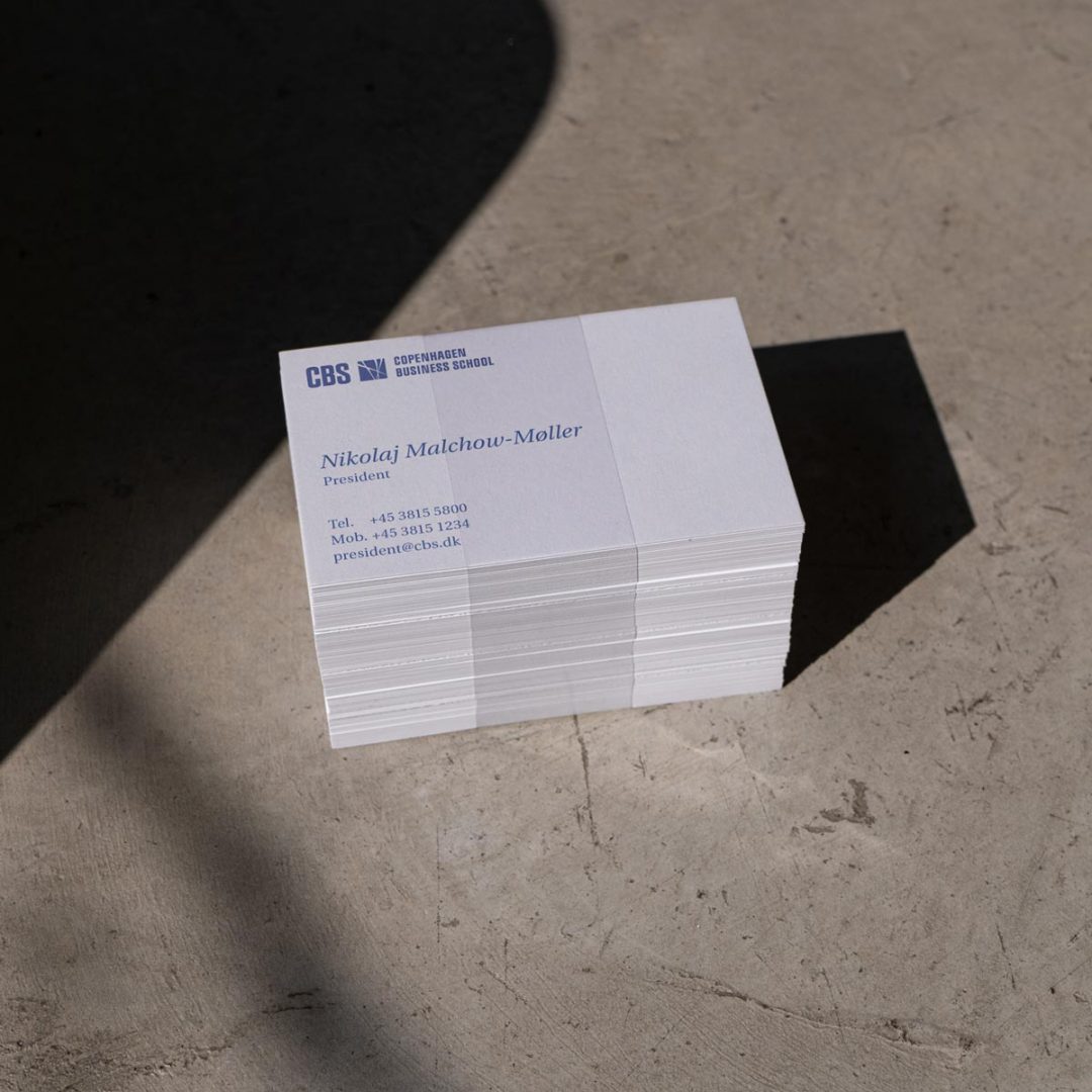
The logo consists of the abbreviation “CBS” and an emblem and can be extended with “Copenhagen Business School” or “Copenhagen Business School – Handelshøjskolen” depending on context (please see below).
The logo text can be changed if needed and this way be used by departments, centres or executive degrees.
The emblem is inspired by the work of art ‘Desargues’; a stabile executed by Steffen Jørgensen in 2001-2003. The lines in the emblem can be interpreted as the different academic fields of CBS intertwining and developing. The work of art is on display at the Solbjerg Plads library.
The official logo is drawn by the design agency 1508 in 2012.
Primary logo
This is our primary logo.
Vertical primary logo
We use this logo for slim formats and for profile pictures on digital accounts.
Extended logo
We use this logo in contexts where it is not common knowledge what CBS represents and the name “Copenhagen Business School” does not appear close by.
Official logo
Our official name is “Copenhagen Business School – Handelshøjskolen”. The above logo should be used for official publications, for instance on diplomas, annual reports, envelopes and letters.
If you are unsure of which logo to use, always use this one.
Other colours
All logos can be used in white against a coloured background.
All logos can be used in a black variant if necessary for readability, printing technique or application with other logos.
Logo for Social Media
For social media profile images, the vertical primary logo is used either as a blue logo on a white background or a white logo on a blue background. Each color variant is available in a version optimised for square and round profile images depending on what is used on the site in question.
On social media, the corporate logo should be used by all units and departments – even units and departments that have their own sublogo.
Sub-logos
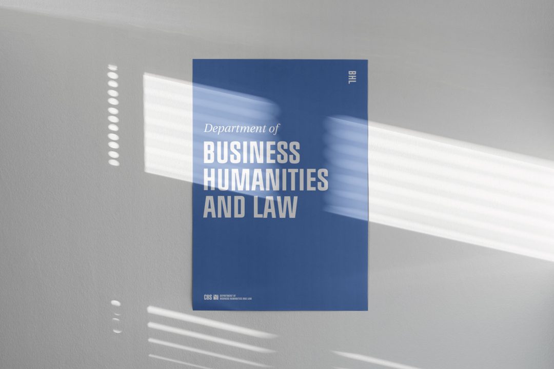
Departments, centres and executive degrees can choose to use a sub-logo instead of the corporate logo where it makes most sense in relation to the target group and communication platform. Sub-logos have the same structure as the extended corporate logo and may not be drawn in variants other than what is available from the list below.
If you have any questions about the use of sub-logos or your centre is missing on the list, please send an email to communications@cbs.dk
Examples of sub-logos
Sub-logos are composed the same way as the extended logo.
Departments
Accounting
Business Humanities and Law
Digitalization
Economics
Finance
International Economics,
Government and Business
Management, Society
and Communication
Marketing
Operations Management
Organization
Strategy and Innovation
Centres
Center for Corporate Governance
Center for Ejerledede Virksomheder
Center for Tourism and Hospitality Management
Centre for Organization and Time
Copenhagen School of Energy Infrastructure
Copenhagen School of Entrepreneurship (CSE)
Imagine.. Centre for Creative Industries and Institutions
Leadership Centre
HD
Co-branding
If more than one CBS unit is the sender, it is possible to add more names horizontally as well as vertically.
The distance between the elements will then be the same as the width of the emblem.
Typography
CBS NEW is CBS’ most recognisable and identity-forming typography. It is used for headlines, but not for plain text, as it is too difficult to read. The font is designed for CBS by the design agency 1508, (and CBS has permanent exclusivity).
CBS Serif can be used for plain text as well as headlines. For headlines we use the Italic version, and for plain text we use regular. CBS Serif’s original name is Heuristica and is designed by Andrey Panov under a SIL OFL open license.
The two fonts CBS New Bold and CBS Serif are a great team but also contrastive. This composition adds even more identity to the design.
CBS Sans is not identity-forming but very readable. We use it for tables, captions and other small-font texts. It is also used for PowerPoints and web plain texts. CBS Sans’ original name is Inter and is designed by Rasmus Andersson under a SIL OFL open license.
CBS NEW
CBS NEW bold is used exclusively for headlines. (CBS NEW regular is no longer used.)
CBS Serif
CBS Serif regular is used for body text in print publications. CBS Serif italic is the secondary choice for headings.
CBS Sans
Used in PowerPoint presentations and online on websites.
Colours
CBS must be recognised by our blue colour as it is just as important an element as our typography and our square grid.
Below you can see our primary, secondary and tertiary colours and defined possibilities of combination.
Primary colours
CBS blue
RGB (73, 103, 170)
Hex #4967AA
CMYK (76, 52, 0, 0)
Pantone 661 U / 7455 C
White
RGB (255, 255, 255)
Hex #FFF
CMYK (0, 0, 0, 0)
Black
RGB (0, 0, 0)
Hex #000
CMYK (0, 0, 0, 100) /
rich black (70, 40, 40, 100)
Secondary colours
Middle blue
RGB (103, 147, 214)
Hex #6793D6
CMYK (60, 30, 0, 0)
Pantone 279 U
Red
RGB (230, 106, 87)
Hex #E66A57
CMYK (0, 73, 62, 0)
Pantone 7416 U
Green
RGB (80, 160, 146)
Hex #50A192
CMYK (70, 0, 50, 0)
Pantone 338 U
Dark blue
RGB (36, 46, 112)
Hex #242E70
CMYK (100, 91, 26, 10)
Pantone 281 U
Chestnut
RGB (107, 28, 38)
Hex #6B1C26
CMYK (34, 100, 75, 40)
Pantone 7421 U
Dark green
RGB (17, 71, 57)
Hex #114739
CMYK (85, 45, 65, 40)
Pantone 3302 U
Tertiary colours (in subidentities)
Light blue
RGB (201, 224, 245)
Hex #C9E0F5
CMYK (19, 5, 0, 0)
Pantone 658 U
Peach
RGB (240, 211, 197)
Hex #F0D3C5
CMYK (0, 15, 15, 0)
Pantone 691 U
Light green
RGB (201, 231, 215)
Hex #C9E7D7
CMYK (21, 0, 20, 0)
Pantone 566 U
Suggested colour combinations
Layout
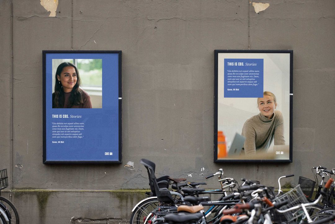
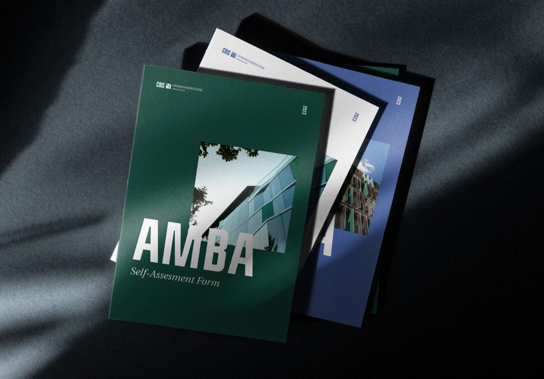
The quadratic shape of the emblem is the starting point of the layout.
Our templates are built on a square system – a grid – which makes it possible to use the quadratic shape as an underlying guide when placing text, pictures or other elements.
The square can also be used for pictures or text boxes.
We recommend to leave plenty of white space around the square on front pages, posters, social media posts and signs.
Your text can be placed with its front or back in parallel with the vertical lines and over or under the horizontal lines.

Illustrations
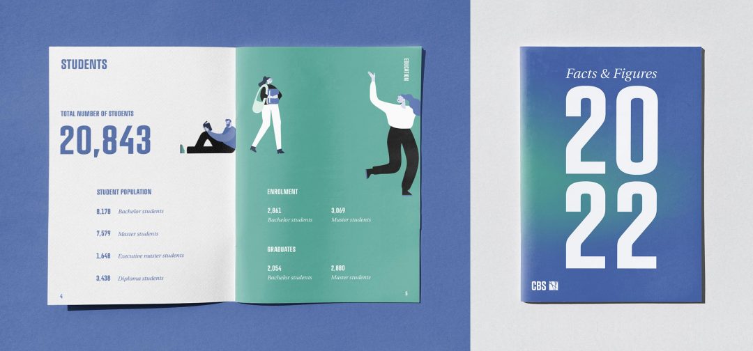
Illustrations can visualise your thoughts and emphasise your points. Moreover, they go well with infographics.
This illustration set primarily consists of people doing different things because at the end of the day research and education have to do with people.
The illustrations can be downloaded in different colour sets and used in presentations, on social or in print media.
Transformation
What does transformation, impact or curiosity look like? “Transformation” is a colour transition underlining these ambitions of CBS’ strategy.
It can be used as background on posters, in presentations, front pages, etc. – and easily with text and photos.
See also our templates page, which include a Premiere Pro template with transformations.
Picture styles
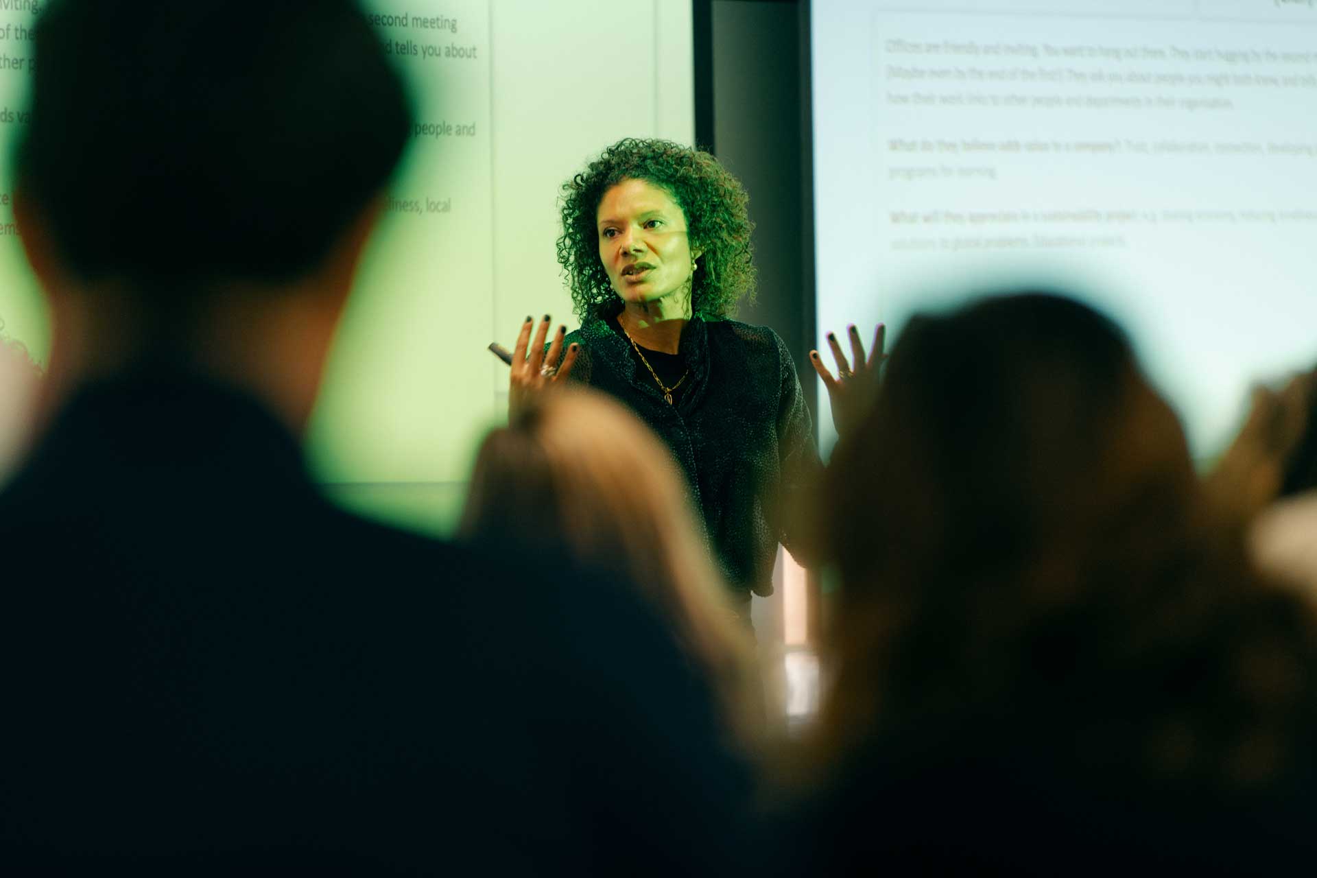
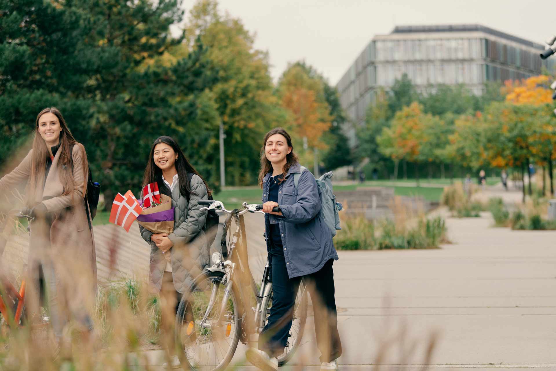
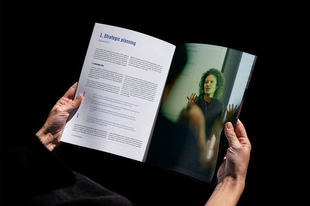
CBS is not characterised through one picture style – there are many. What ties them together is the common experience CBS wishes to create across media and formats.
One common experience of CBS is created through our experience design.
All CBS employees have access to the various images in the photo database but must be on the CBS network or use VPN to gain access.
The aim is to create an experience, where the user feels Invited and Ignited. To achieve this, the following criterion is particularly important when selecting photos:
“We are authentic. We act reliably, sincerely and realistically to inspire confidence. We portray real people of flesh and blood.
We are part of society.”
In other words, we wish to portray real CBS people in real-life settings. It could be on campus but also in society where we make a difference.
We would rather show the genuine essence of CBS than all the shiny things, and activity rather than inactivity.
The photos above were taken by photographer Kasper Kristoffersen.
paper
When printing, the choice of paper is important for the final look.
At CBS we use white, uncoated paper. This means paper in a matte, slightly rough quality as opposed to glossy paper.
For publications, we recommend these paper qualities:
– Amber Graphic
– Multidesign Original White
Amber Graphic is the cheapest, but it is not available for smaller print runs.
